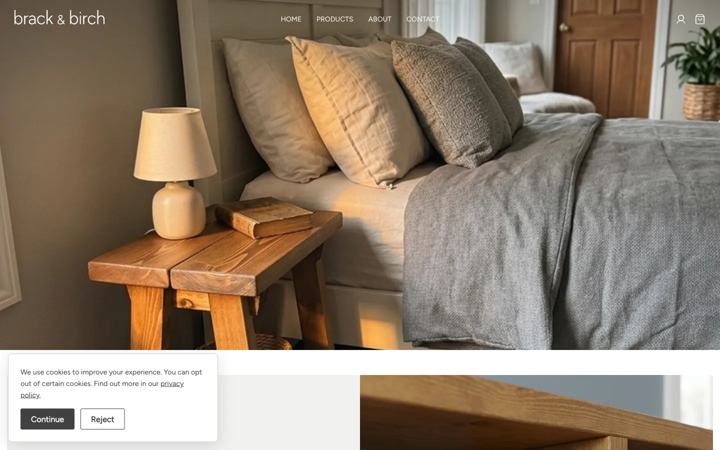
Every so often a project comes along that's a genuinely nice fit for how I like to work: a client with a good product, a clear problem, and no interest in over-complicating the solution. Brack & Birch was one of those.
The client makes handmade furniture in Yorkshire; bedsides, benches, bookcases, coffee tables, console tables, shelving, mostly in reclaimed wood, mostly built to order. For a couple of years, Etsy had been doing the job of finding customers. It's a fine place to start. It is not a fine place to stay.
Why Leave Etsy At All?
Etsy is brilliant for getting your first sales without needing to think about a website at all. But it comes with a ceiling built in. Every transaction takes a cut. Every customer belongs to Etsy's search results, not your mailing list. Your shop sits one scroll away from three other people selling something similar, sometimes cheaper, sometimes worse. And no amount of nice product photography changes the fact that the site around your listings looks like Etsy, not like you.
For a brand built on craftsmanship and reclaimed materials, that's a real cost. The whole pitch is "this was made properly, by someone who cares." That story doesn't land the same way squeezed between unrelated search results.
What the Site Needed to Do
The brief was straightforward: a standalone site that looked and felt like a proper furniture brand, not a marketplace listing, while keeping the buying experience just as easy as what customers were used to on Etsy.
That meant a few things had to be right. The photography needed room to breathe, since the wood grain and joinery detail is most of the sell. The categories needed to make sense to someone browsing by room or by piece, not by internal product codes. And the checkout needed to feel like any other online shop, not a bespoke quoting process that adds friction before someone can hand over their card details.
The Custom Sizing Problem
The one genuinely tricky bit was custom sizing. Most of the range is available in a handful of standard dimensions, which WooCommerce handles natively as product variations. But a fair chunk of orders are one-off sizes to fit a specific alcove or hallway, and building out every possible combination as a variant was never going to work.
The fix was to keep standard sizes as normal variations for the pieces that come in a small range, and add a simple custom dimensions option that opens a note field at checkout for anything outside that. It's a small thing, but it means the site can handle both an off-the-shelf sale and a bespoke commission through the same cart, without either one feeling like an afterthought.
Built on WordPress and WooCommerce
Under the hood it's WordPress and WooCommerce, which was the right call here. The client didn't need anything custom-coded to manage stock, orders, or content; they needed something they could log into, update, and not think about too hard. WooCommerce gets that balance right for a catalogue this size, and it meant I could focus my time on the design and the product experience rather than reinventing an ecommerce platform nobody asked for.
A Nice One to Ship
There's something satisfying about a project where the product is already good and the website just needs to get out of its way. Brack & Birch didn't need convincing customers that the furniture was worth buying; it needed a home that did the craftsmanship justice and let people buy it without a middleman taking a cut of every sale. That's a good brief, and it's one I'd happily take again.
You can see the finished site at brackandbirch.co.uk.